Page 1 of 2
Check out the new website!
Posted: Sat Apr 30, 2022 9:57 am
by Steve Sokolowski
We're proud to announce that Prohashing's new website is now live with a preview version at
https://preview.prohashing.com!
The new website has all the features of the old one, and changes to your account using the new website are made in the database as the old site currently does. Or, you can stick with the old site for now if you prefer.
Michael has been hard at work on the new site for half a year, and he welcomes your feedback as we move towards the final release of the new design!
Re: Check out the new website!
Posted: Sat Apr 30, 2022 7:36 pm
by UbjfP2ZOJa
Looks good!
One suggestion: On the balances page (
https://preview.prohashing.com/customer/balances ) in the Performance chart I'd rather see Earnings be the green color, and Electricity Cost be red.
When do you expect to completely switch to the new version?
Edit: On
any page with earnings and electricity cost.
Re: Check out the new website!
Posted: Sun May 01, 2022 8:56 am
by Banished_Privateer
New forum tab loads with big lag spike unlike the old one, consumes also more CPU & RAM.
Re: Check out the new website!
Posted: Sun May 01, 2022 12:53 pm
by Todiefor
Sorry, but the sharp contrast between the dark blue background and the red and green and also the white text hurts a bit in my eyes.
Re: Check out the new website!
Posted: Sun May 01, 2022 5:10 pm
by TechElucidation
I have never been a fan of the "dark theme", but will survive. However I will add the choice of red on this background may make it a little hard for people with Protanopia (red color blindness, the most common form) to see.
![Image]()
I have to agree with UbjfP2ZOJa that the bar graphs should be switched around, though I suspect this was a mistake since if you click on the "Data" option the earnings are in green and the cost in the read.
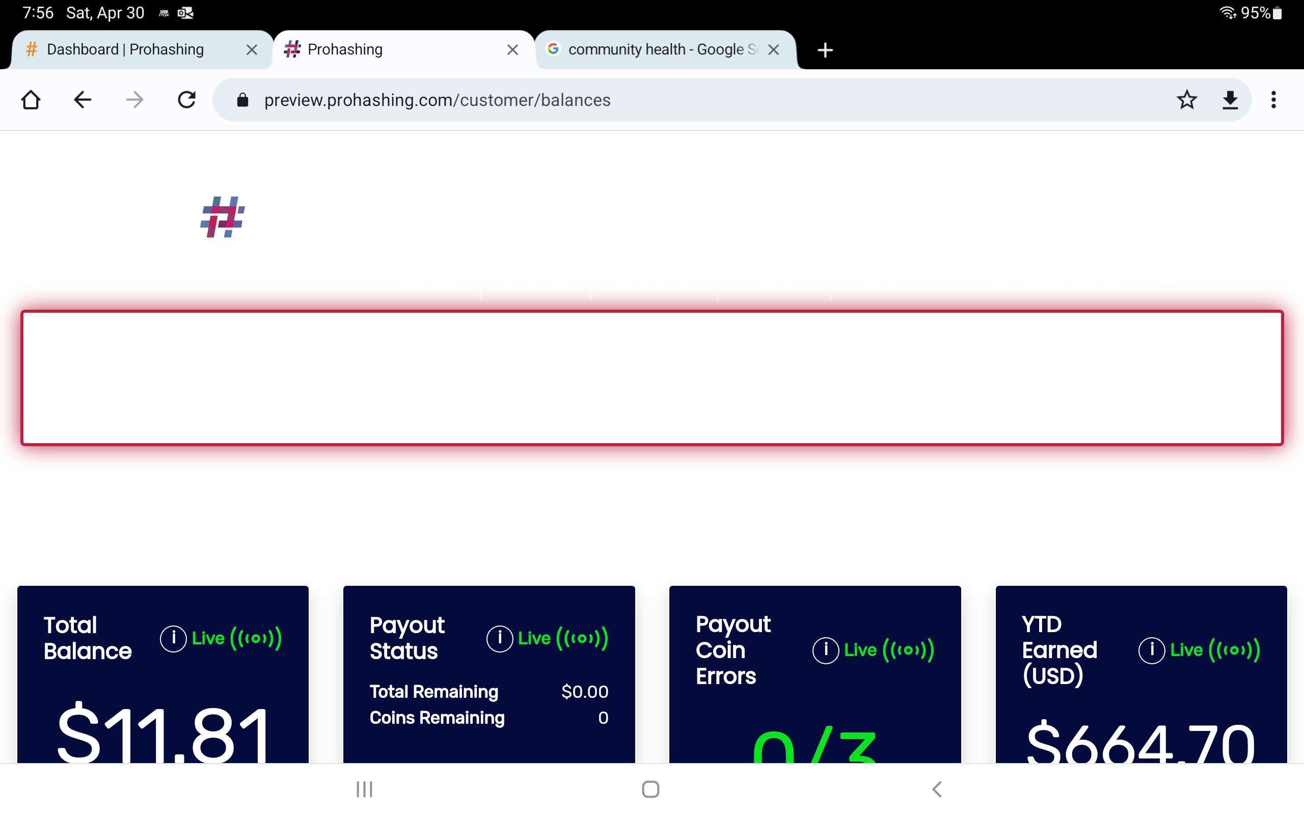
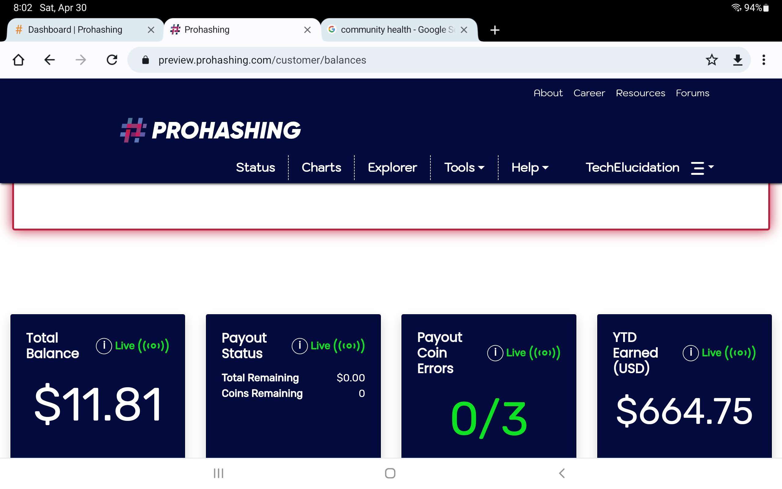
Finally, and odd bug occurs on my Samsung Galaxy Tab S7, that the blue background disappears, leaving a white background that makes most text impossible to see. This only happens in landscape mode, if I rotate to portrait it renders correctly. I don't have this issue on my phone (Pixel 6), Kindle Fire HD 10, work iPad, or any desktop. Only on that one device, and only in landscape.
Here it is portrait mode.
![Image]()
In Landscape you can see the main background is white, but the call out boxes are blue.
![Image]()
If I scroll down a little, so the menu at the top becomes a breakout from the main page, then it turns blue as well.
![Image]()
Just figured I would report that.
Re: Check out the new website!
Posted: Sun May 01, 2022 5:58 pm
by Steve Sokolowski
Thanks for all the feedback! Michael will look into all of these issues and will reply as soon as he has some answers.
Re: Check out the new website!
Posted: Sun May 01, 2022 6:24 pm
by TechElucidation
Hi,
I also decided to try a few different browsers (that was on Chrome) and found that DuckDuckGo and Opera both looked the same.
FireFox seemed to render correctly.
However Edge had a different problem.
![Image]()
Re: Check out the new website!
Posted: Mon May 02, 2022 8:33 pm
by bMeister1
Looks good on Firefox! I don't know if this because this is a preview and not the full finished product yet, but I was unable to change the mining algorithm or month tab in the chart section. It was stuck on Scrypt. Everything else on the page seemed to work fine though.
Re: Check out the new website!
Posted: Tue May 03, 2022 11:20 am
by michaelsteward
TechElucidation wrote: Sun May 01, 2022 6:24 pm
Hi,
I also decided to try a few different browsers (that was on Chrome) and found that DuckDuckGo and Opera both looked the same.
FireFox seemed to render correctly.
However Edge had a different problem.
![Image]()
Hi,
I deployed a new version of the preview that should address the background not loading correctly on some mobile browsers. Can you verify that the issue has been resolved on your galaxy tab s7? Still troubleshooting the edge specific issue.
Re: Check out the new website!
Posted: Tue May 03, 2022 11:27 am
by michaelsteward
bMeister1 wrote: Mon May 02, 2022 8:33 pm
Looks good on Firefox! I don't know if this because this is a preview and not the full finished product yet, but I was unable to change the mining algorithm or month tab in the chart section. It was stuck on Scrypt. Everything else on the page seemed to work fine though.
Thanks for pointing out this bug. The issue has been resolved and will deployed in the next day or so.


